Hippocrates Health Institute Redesign
Hippocrates Health Institute is a large, luxurious organic spa and wellness living organization that promotes holistic healthy foods and offers a training program for Health Educators. The problem they were facing was an inundation of phone calls to their customer service teams because the website did not do a good enough job explaining the programs. There was also no way to sign-up online, hence the flood of calls. Hippocrates contacted me to analyze and improve the website structure, as well as provide art direction.
2 Types of Users

Health Educator Students
I interviewed the Director of Marketing and his Marketing Coordinator and also had access to many of the photos of the students. Most were 30 and above, female, and had already been involved in holistic or alternative healing modalities. They were mostly tech-savvy and from all over the world. We needed to adapt the website so they could find out everything they needed about the program and sign-up online. The site needed to convey creditability through transparent content and ease-of-use.

Life Transformation Program Patrons
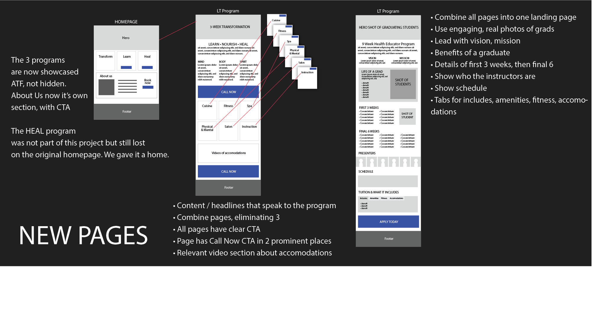
Hippocrates targets mostly white, affluent people who are looking to improve their health through holisitic raw diets, detoxing, stress-reduction, and therapuetic spa and alternative health practices. The Director of Marketing took me for a tour around the vast, luxurious premises. Patrons stayed in a variety of housings on a landscaped 50 acre campus. On the tour I saw a wide-variety of people, of many ethnicities and from different parts of the world. We needed to create a landing page that clearly layed out the program, the housing, and a way to sign-up. We also needed to showcase through real onsite photography the grandeur of the facility.
3 Types of User Flows
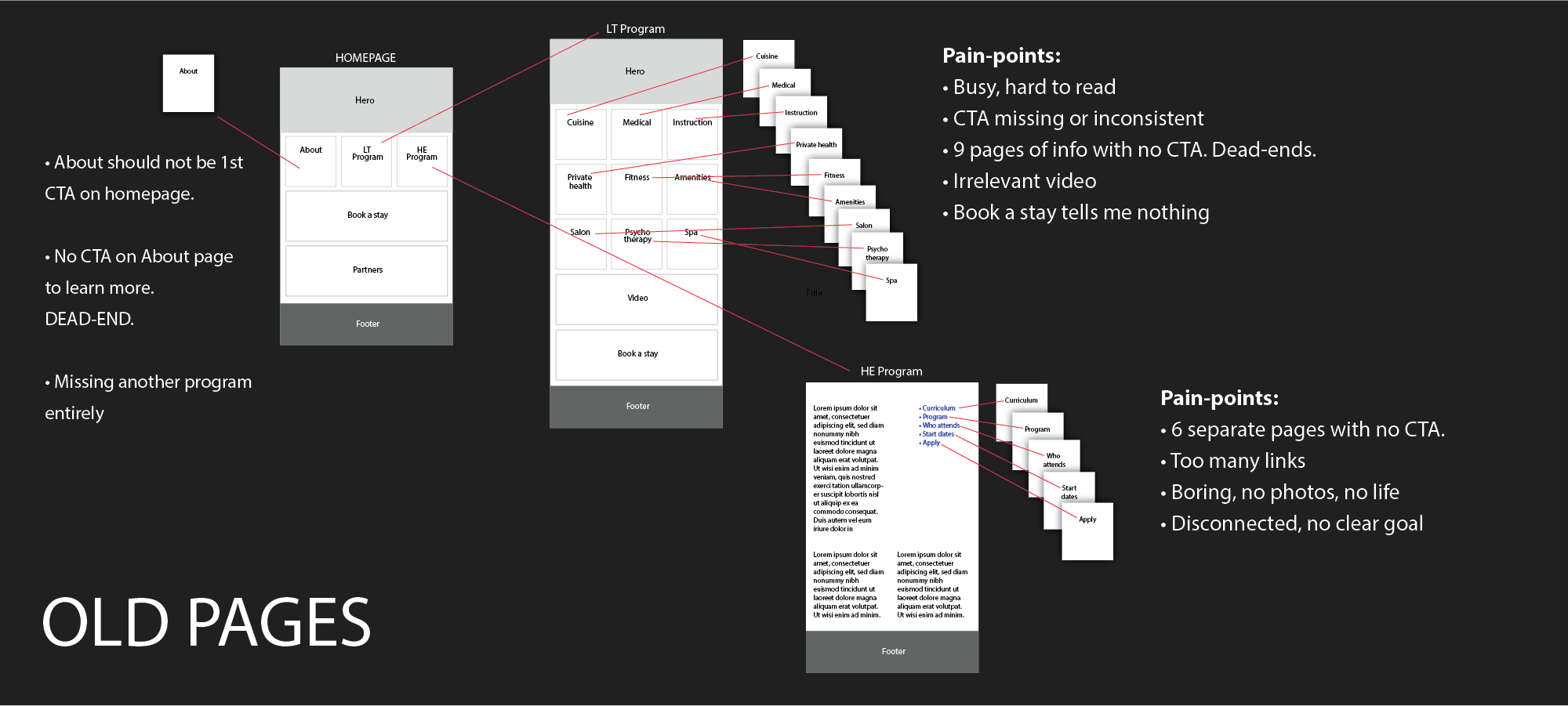
Our primary focus for the redesign was the homepage, and landing pages for the Life Transformation Program and Health Education Program. The homepage was not driving traffic to the two programs because there were no clear call-to-actions. The Life Transformation Program page led users down a wild click-path to hunt for more information and dead-ended them with no call-to-action. The Health Education Page was disjointed, filled with irrelevant and distracting links, no connection to real human students and a hard to find application CTA.
Requirements
- Increase online-signups and reduce call-center time
- Convey creditability through useful content and reducing amount of clicks
- Convey a luxurious and wholesome brand through authentic photography, color-palette and tone-of-voice
Site Architecture / Content Strategy
We started with the site architecture. The first attempts were hand-drawn and iterated further in digital mockups. Our primary pain-points were unclear CTAs, dead-ending, too many clicks, redundant pages, irrelevant or little content, and users just getting lost. We eliminated redunancy, placed strong CTAs on connecting pages, and totally redesigned the Educator program page to be people focused, using real photography of students and graduates. We also used optimistic language that spoke directly to the benefits of taking this program
Results
Hippocrates has seen more traffic on the site, particularly the new Health Educator page. Online sign-ups have increased and call-center load is down. Feedback from users is that they are able to “shop” the website for all the information they need before they decide to make the call, making them a more informed and confident customer who has more trust for the Institute.
