UX / UI eCommerce Home Furnishings Concept Study
This was a design challenge for a furniture retailer, which resulted in a job offer. The concept was to align the in-store customer experience with online experience.
2 Types of Users

Lynn in Sales
I interviewed “Lynn”, a sales associate. Her feedback on the existing website was that it could do a better job helping customers dream and be inspired before coming in. The showrooms are beautiful, the online experience should represent that.

The Customers
In my observations of the store and conversations with sales staff, I learned that customers were incredibly diverse, and that diversity would change depending on where the many stores were located. There was a growing segment of millennial families buying first homes. The most prevelant in-store customer was 50+ and female. There were also second home owners. I learned customers were driven by web or email to the stores and didn’t always find the information or inspiration they needed online.
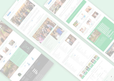
Challenges
The Category Page presents a unique opportunity for a customer to browse and be inspired – like in a real store – enough to take action. This store is missing an opportunity with underwhelming category pages.
Category Page challenges:
- Utilitarian – just an image with links
- No story
- No inspiration
- No strong CTAs
Requirements
- Inspire and curate
- Show breadth of offerings
- Entice customer to visit store
- Invite customer to convert online
“Don’t sell the product. Sell the experience that sells the product.”
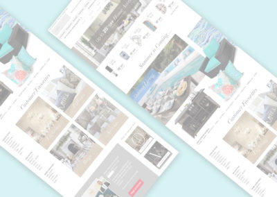
A Possible Solution
Research was conducted on competitors like Crate and Barrel, Pottery Barn, and Wayfair. These are some of best practises during that research for creating a better online experience for furniture stores.

Above the Fold
- Side navigation now at top to expand width for more storytelling.
- Offers above the fold.
- Whole room photography.
- “Ends” verbiage to add urgency.
- Additional navigation text to shop “All sale items.”

Seasonal Offerings
- This was not on the original page at all. Get customers excited with seasonal products ahead of time.
- Strong headlines.
- Show a room in actual use.
- Show a variety of coordinating items.
- Use additional navigation at the bottom to lead customers back into other options.

Customer Favorites
- Keep high-performing categories on the page, show lifestyle shots.
- Faceted navigation on side gives other options to shop on otherwise long page.

Above Footer
Final Call-to-Action
- Introducing a real member of the sales team to reinforce the in-store experience.
- Call-to-action to find a store.
- Cross-merchandising for signature lines.

Summary
The goal here was to create an online experience that reinforces and continues in-store experience. The in-store experience includes beautifully set displays and attentive sales people. A more attractive online store that allows customers to browse freely and be inspired will help them feel more ready to purchase when they come into the store, or allow them more confidence buying online.