UI Design


For almost a decade I’ve helped retailers develop a more attractive online presence that elevates their brand, attracts and retains more customers, and expands the business. I have worked as the sole generalist as well as a focused specialist amongst a larger team. My contributions have been featured in Baymard.com, and I have lent my hand to many major redesigns. I have also led and mentored teams.
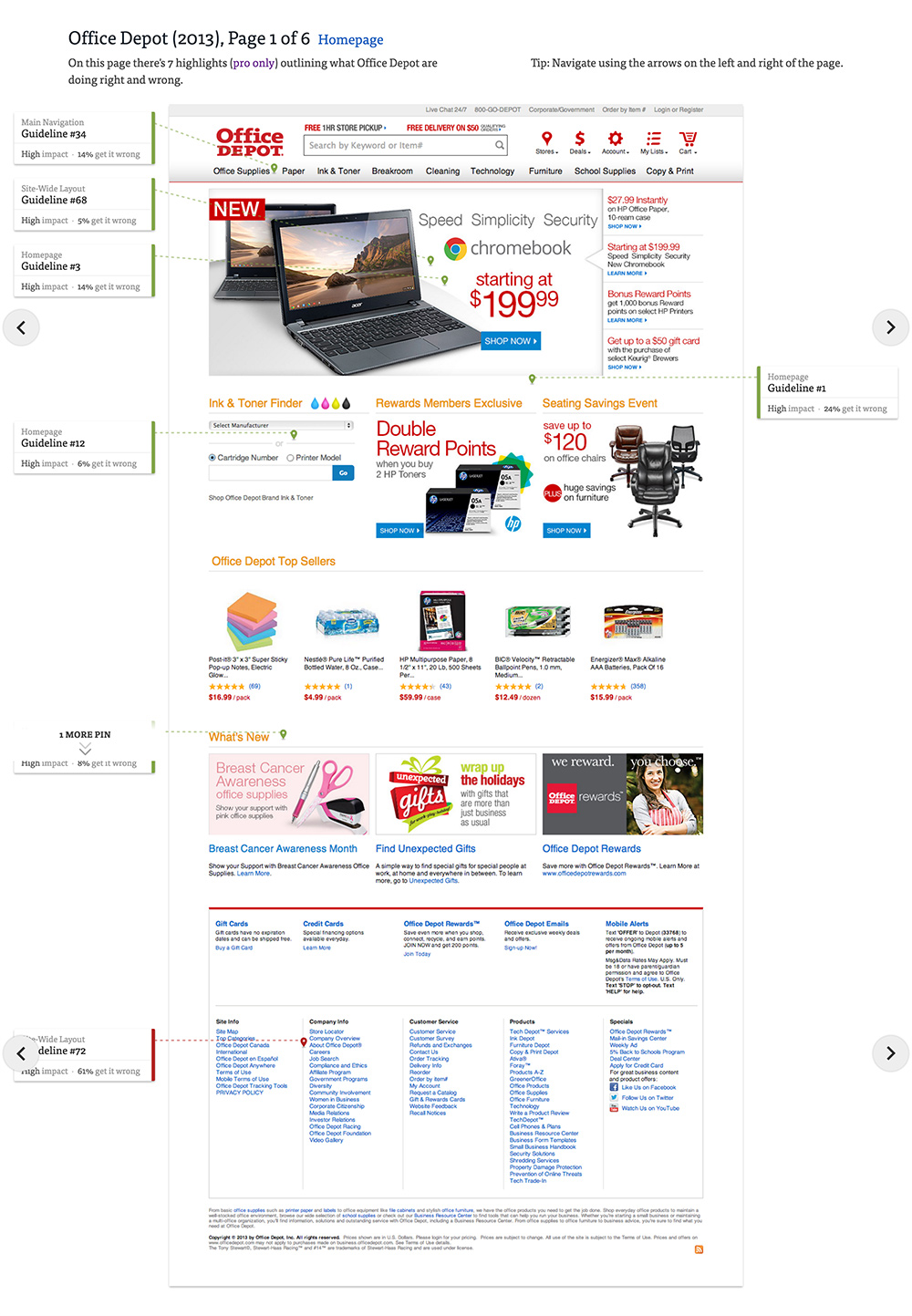
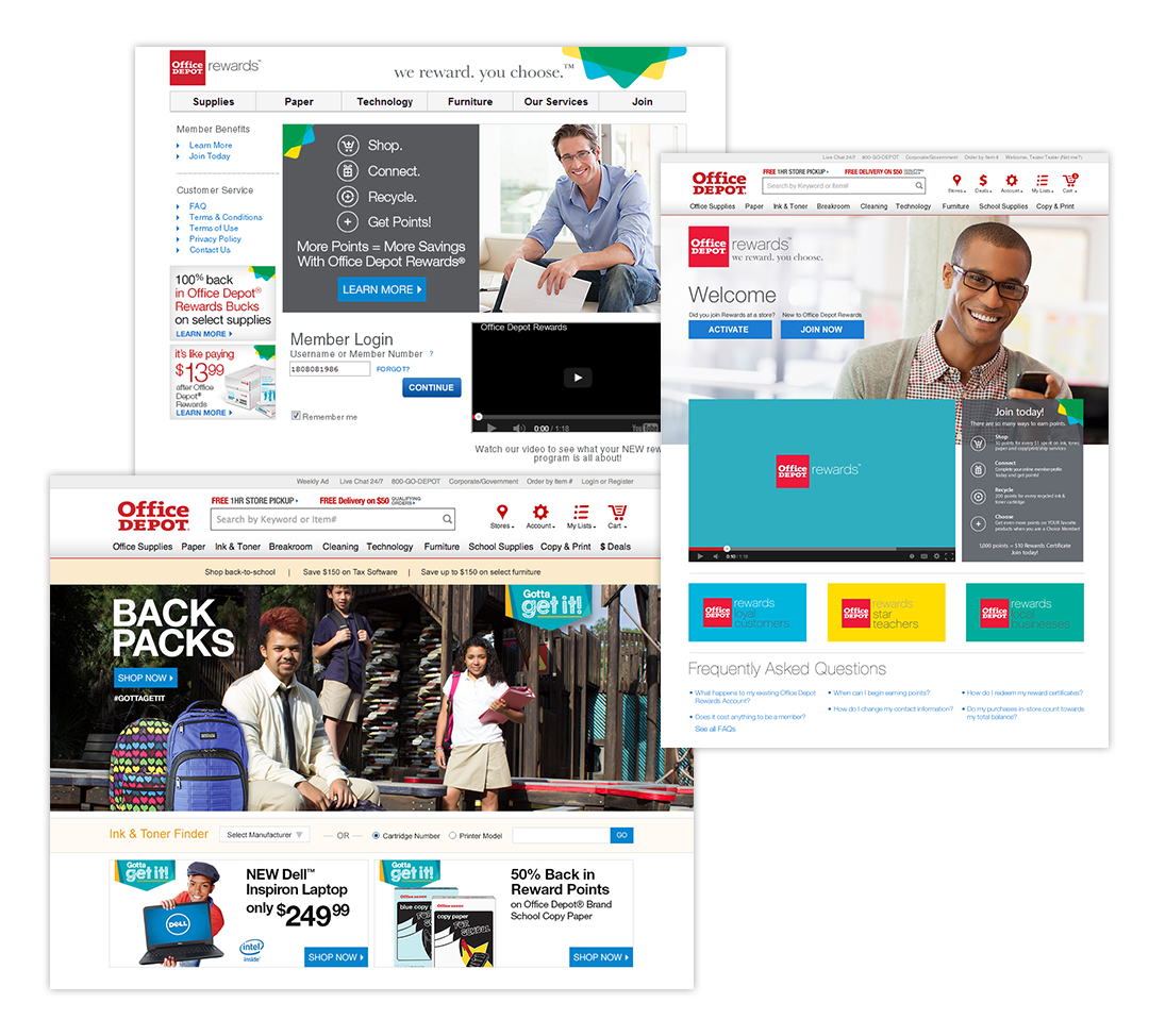
Office Depot Storefront – 2013
I worked with the UX team to iterate and user test many designs. I also worked with the marketing design team to modernize graphic treatment.
Result: The new look and feel set the pace for an entire site upgrade during a major growth phase.
Old storefront
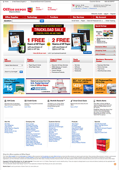
Upgraded storefront as seen on Baymard.com.
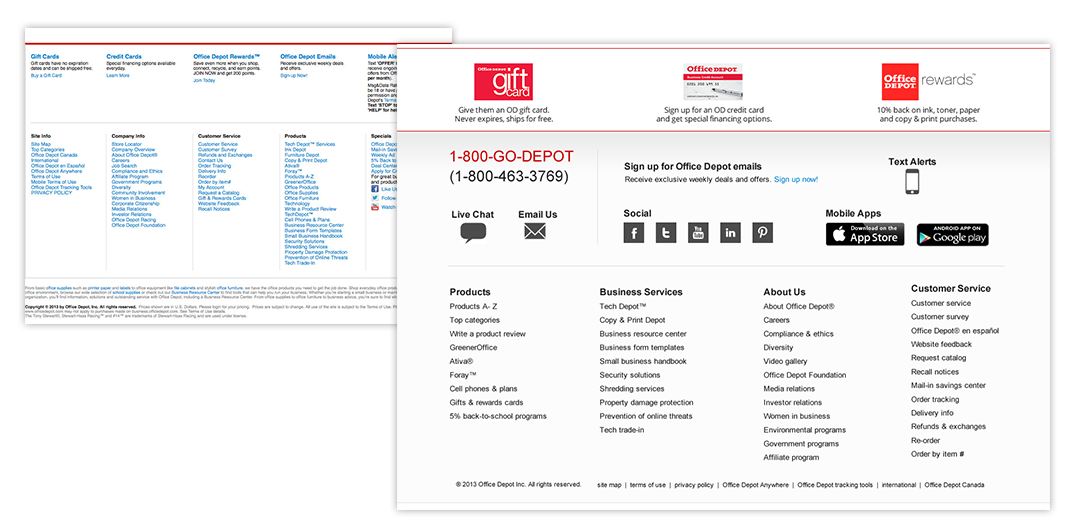
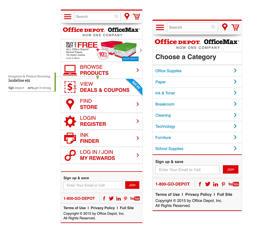
Office Depot Footer & Menu
2013 Footer
- Old footer with stacks of blue links
- New is cleaner, more modern
- Prominent placement for popular programs
- Clear contact info
- Clear social media and app download
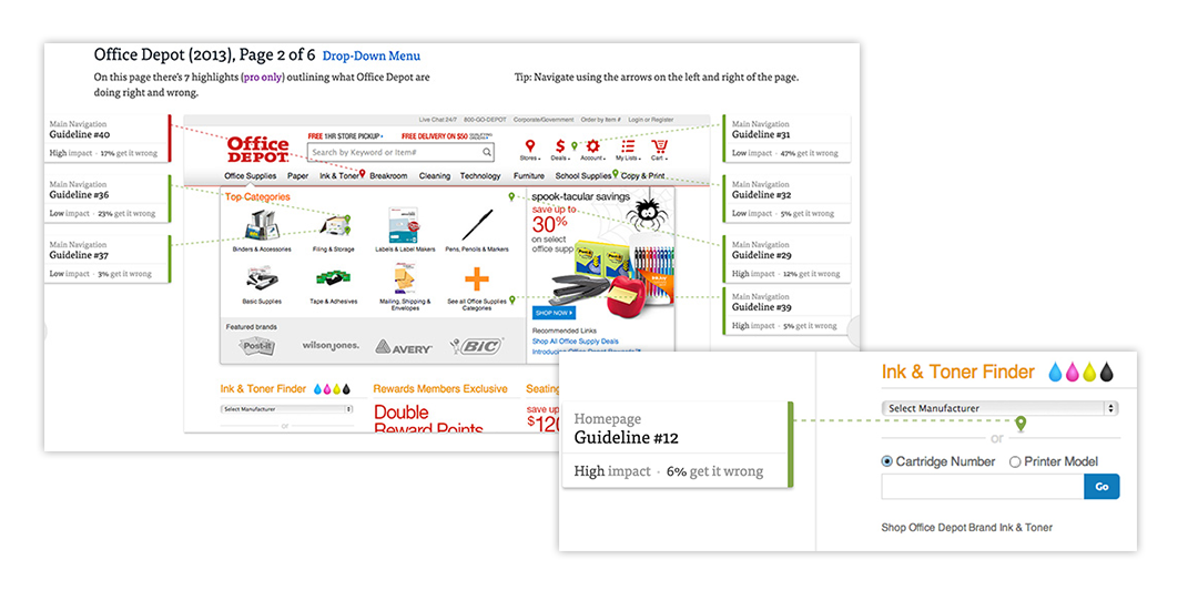
2013 Menu Flyout and Ink & Toner
- As featured in Baymard.com
- Flyout is new feature for top menu
- Featuring top categories
- Ad placement
- Ink & Toner Finder redesign
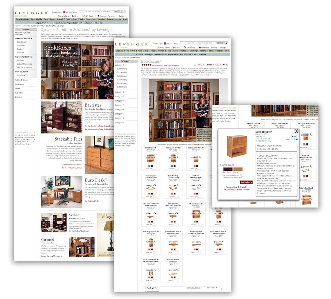
Levenger Furniture Redesign – 2011
Levenger sold 6 major collections of component based furniture. The compenents were all on separate pages and the user couldn’t envision what they would look like assembled. I reconstructed the IA and created a landing page for the different collections that led to a componenent page that showed a final product as well as on-page shopping that kept users on one page.
