UX / UI Redesign Case Study – Digital Self Services
WHO: Bluegreen Vacations, a timeshare company with a points-based system and multiple resorts owners can reserve in North America.
WHAT: A digital conversion product where potential timeshare owners book vacations purchased as affordable hotel packages in retail kiosks. They are then presented with opportunities to upgrade to a Bluegreen resort online. They can also call Customer Care respresentatives to perform the same tasks.
TIMELINE: 10 months.
MY ROLE: As Senior Customer Experience Designer, I participated in moderated user testing, research, personas, customer journey maps, stakeholder interviews, information architecture, journey mapping, wireframing, interaction design, prototyping.
THE TEAM: Lynn Van Dyke, head of CX Research; Babette Geer, CX Researcher; Jhanille Smith, Jr CX Researcher; Novak Mirkovic, Mgr Analytics & SEO; Romayne Taylor, Analytics & SEO; Matt Dellinger, Front End Engineer; Danny Rozo, Product Owner; Lisa Lee, Business Analyst; Nikki Amatuccio, Customer Care Manager; Paul Lambrakis, Copywriter; Sapient Razorfish, CAI, etc.
PROBLEM: An old website with technical problems and usability issues was not converting and causing frustrated customers to bombard call centers. The call centers also had to use this website, and expressed their frustrations to the business. It was also unattractive and stakeholders wanted it to be a nicer experience, hoping to boost conversions.
RESULT: Our CX team made recommendations based on extensive user testing and research resulting in an effective, improved design. Extensive tech debt and bugs caused major delays in implementing the design, and the project was stalled due to the Coronavirus.
Test existing site

We had 10 participants, 45-74 years old, 5 males and 5 females, from low to better than average tech skills, with an income of $55,000 to $100,000. 3 had been on a timeshare tour or had owned a timeshare. All participants have pre-planned vacations with digital tools like TripAdvisor.
User testing results
- Painful struggles with registering or creating a password
- Vacation details summary did not match what they originally purchased
- Summary did not update when users upgraded or extended nights
- Hotel address not revealed
- Users assumed upgrades to resorts were where they stayed
- Users assumed Welcome Centers (registery locations) were where they were staying
- A barrage of annoying emails asking for constant upgrades
- Confusing date-picker experience

A Need for Clarity

- Users were unclear they were staying at a hotel and not resort
- The use of “getaway” caused users to think they were staying at a Gateway
- Gift codes written in a non-human facing language, users not sure what they were getting (MC, 2AD, GC)
- Language “feel free to reach out” and no way to do so
- Users unclear where they were staying
- Users not clear about duration of the tour, or even if there was one
Personas
We based our participant selection on previous customer research, and started creating personas based off them. We conducted competitor research with usability tests on the Digital Self Service product. We tested on desktop, tablet and mobile devices.

Recommendations
Our Customer Experience team made over 20 recommendations for the business to follow up on. Here are a few of the most relevant.
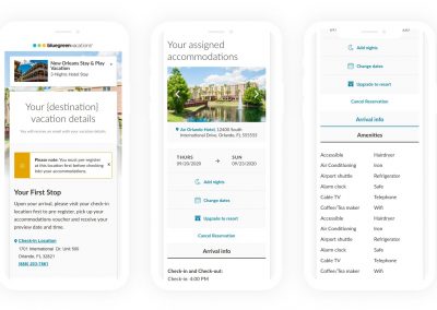
- Make design and copy changes that make it clear a customer is staying at a hotel and not resort
- Clarify through design and copy that check-in location is not where they are staying
- Provide a comparison chart “hotel vs. resort” so customers understand exactly what they’re getting, and give them a choice
- Provide customers with a confirmation number
- Ensure summary updates in real time with every action a customer takes
- Use understandable language for the gift items

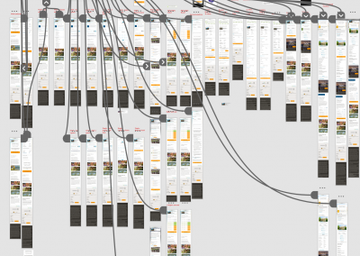
Journey mapping
There were multiple scenarios a customer could experience. The scenarios were mapped out by flow. Sticky notes were placed with customer pain points where clarity was needed on whiteboard. An ideal flow was created with Lucid Chart.


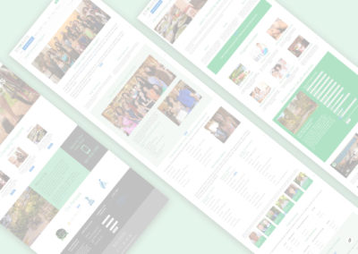
Final design
The site was recreated on Sitecore, a robust CMS. We were able to utilize personalization. Copy added clarity as to what customers had purchased, and what to expect. Photography and modern design style was incorporated.