UX / UI Redesign Case Study – Healthcare Services
WHO: New World Medical Network
TIMELINE: Less than 6 months
MY ROLE: Content & Taxonomy Audit, Interaction Design, Copywriting, Testing, UI Redesign, Development
RESULT: Increased signups from medical partners and companies seeking to reduce health insurance costs
2 Types of Users

Companies, Unions, Government Agencies
The company deals with the HR managers of corporations, unions, and government agencies who are looking to save costs on health insurance for their employees.

Employees
The employees who benefitted from these plans needed an online place to find the information, sign-up for procedures and choose locations.
Challenges
The stakeholders felt their website looked outdated and were hearing complaints that users were confused. They were expanding their business and knew their site needed a complete overhaul.
Main pain points:
- Homepage failed to convey clearly what company offered
- Confusing navigation and taxonomy
- Overwhelming copy
- Redundant content
- No points of conversion
- Outdated design
Requirements
- Integrate homepage with new customer intake form
- Simplify site structure
- Create clear points of conversion and calls to action (CTAs)
- Reduce content overwhelm, simplify language
- Refresh the brand and UI

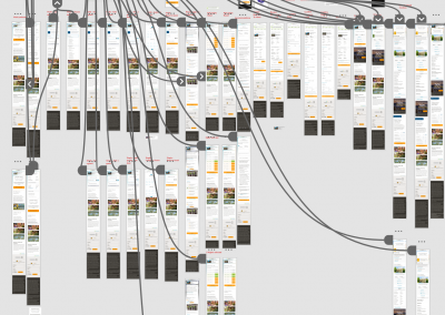
Before: Old site architecture
The project manager and I worked with printed pages of the site on a wall and with scissors, stickie notes and tape, reworking the structure and eliminating obsolete content. We used the principle of progressive disclosure to guide users down a path to a distinct call-to-action and simplifying the site structure in the process.

After: New site architecture

New Design
We created a working protoype of the site directly in WordPress and iterated the pages in Photoshop, submitting them for group review with the stakeholders. We arrived at cleaner, much more user-friendly interface, and a more modern look and feel.

Homepage: Old vs. New
- Clearly defined primary CTAs
- Reduced content, clear headlines and copy
- Simplified navigation
- Removed confusing items
- Clean, minimalist design


Other Iterations of the Homepage
The team went back and forth on a few details such as the video. The video was of poor quality and they had no time to improve it before launch, it was removed. We reduced copy and discussed what direction the photography would take. We settled on a very minimalist, abstract design, and reduced CTAs to essentials.

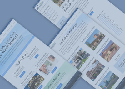
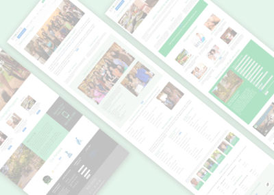
Facilities Landing Page
- Old page showed facilities with no descriptions of offerings or doctors
- Added new landing page and individual bio pages for each facility
- Added CTA for medical facilities to join network
- Added CTA for companies to learn about the service
- Sidebar nav gives access to other facilities
- Bullet points about the facility on bio page
- Doctors and links to their bios


Summary
The new improved design and user experience allowed the company to start moving in a growth position again by being able to sell their packages while having a new interface for customer sign-up.