UX / UI Redesign Case Study – Vacation Details Page
WHAT: A specific page within a digital conversion product where potential timeshare owners book vacations purchased as affordable hotel packages in retail kiosks.
TIMELINE: 4 months
MY ROLE: As the main designer, I participated in moderated user testing, research, personas, customer journey maps, stakeholder interviews, information architecture, affinity mapping, wireframing, interaction design, prototyping.
THE TEAM: Lynn Van Dyke, head of CX Research; Babette Geer, CX Researcher; Jhanille Smith, Jr CX Researcher; Novak Mirkovic, Mgr Analytics & SEO; Romayne Taylor, Analytics & SEO; Matt Dellinger, Front End Engineer; Danny Rozo, Product Owner; Lisa Lee, Business Analyst; Paul Lambrakis, Copywriter; Sapient Razorfish, CAI, etc.
PROBLEM: Customers logging in to book their hotel stays did not immediately know where they were staying because of an outdated logistical system. Participating hotels could only be faxed reservations manually, and customers would not know the hotel or address until 3 days later. Bluegreen implemented a Global Distribution System that allowed hotels to input their information into a database. Customers would now get their hotel address, photos, amenities, etc as soon as they booked. Since this page had never existed before, we created it.
RESULT: Our CX team made recommendations based on extensive user testing and research resulting in an effective, improved design. Extensive tech debt and bugs caused major delays in implementing the design, and the project was stalled due to the Coronavirus.
Test existing site

We had 10 participants, 45-74 years old, 5 males and 5 females, from low to better than average tech skills, with an income of $55,000 to $100,000. 3 had been on a timeshare tour or had owned a timeshare. All participants have pre-planned vacations with digital tools like TripAdvisor.
User testing results
- Users did not understand where they were staying
- Some locations have a pre-register location different from where they will be staying. Since users assume an instant location when booking, they assumed wrongly they were staying there
- When users experienced the upgrade to resort section, they assumed these were rooms to choose from, added them, and were distressed to see additional charges they didn’t understand
- In some instances they were shown no hotel address but a message to check back, and logos for participating hotels, creating distrust


“Where am I staying?”

- Users who booked a vacation where they could register directly wanted to know where they were staying but couldn’t
- When clicking “Accommodations – Where will I be staying?”, a section opened up with copy to “check back soon” (when?) and Choice hotel logos. This did not instill trust, and worse, lowered expectations
“It’s a trap!”
- Users thought the “Check-in Location”, or “Welcome Center”, was where they were actually staying
- Those that understood it was not their final destination wanted to know where there were staying, and when they would find out
- Those that understood what it was thought this is where they had to go first to be trapped into a high-pressure timeshare presentation

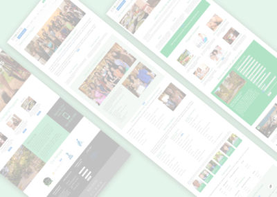
First Iteration
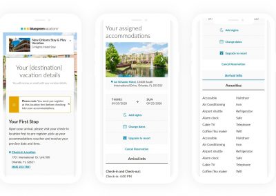
The site was recreated on Sitecore, a robust CMS. Using personalization, we are now able to directly address the customer like a human. We used human-facing language that let customers know more about their trip, and excite them to go. We made the hotel location the primary focus, the “Welcome Center” secondary. The Global Distribution System details also painted a clearer picture of what the customer could expect.

Final Design
We conducted a round of on-site moderated user-testing both face-to-face and remotely on the first iteration. I thought we could still make it clearer to the user that where they were staying and the Welcome Center were 2 distinct and different places.
The testing validated the concerns. The concept of registering somewhere else first was completely foreign to them. I worked with our research team conducting the tests, acting as as a simple observer. The research team collected findings and made recommendations. I worked with the copy team, which removed the personalization (they don’t need to be told their name multiple times), used an alert notification, and copy told a clear headline “Your First Stop” and explained what would happen. UI was tweaked for better mobile usability.